
Redesigning Goodreads
Summary
The popular website, Goodreads, is used by many avid readers and authors to explore the literary world. Unfortunately, the site is lackluster and desperately needs touchups to visuals and content. My project is a re-design in both a desktop and mobile form, utilizing UX principles to make the experience of Goodreads better for its users.
Challenge
Goodreads has a lot of content on its pages, with book covers and text. The challenge lay in complementing any cover with negative space with tasteful color choices and making necessary decisions on what content to cut out of the pages.
My Role
I was the sole person on this project and conducted research, design, and testing.
Completed UX analysis of Goodreads
I evaluated the Goodreads site with 4 main components: Content, Visuals, Findability, and Usability. Goodreads functioned well as a product, even if the tasks sometimes took longer than necessary, and the information architecture facilitated decent navigation. However, Goodreads’ problem lies with the lack of visual consistency with text, color, and component styles, and the content lacked proper structure and polish. There were large gaps on pages, redundant information, and inconsistent translation of the desktop to the mobile experiences.
Implemented multiple levels of design
User Flow
A feature of Goodreads is the ability to access books and mark the books with different statuses, like “Want to read” and “Completed.” I first analyzed the current flow for signing into Goodreads and changing a book status, before re-designing the flow to condense steps. This included removing a single page that could be a dropdown menu and making what was a modal into a dropdown menu.


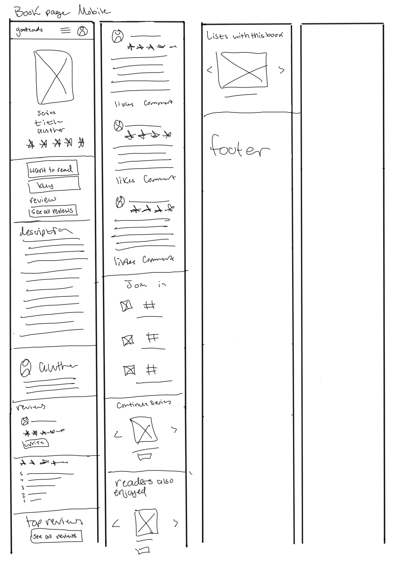
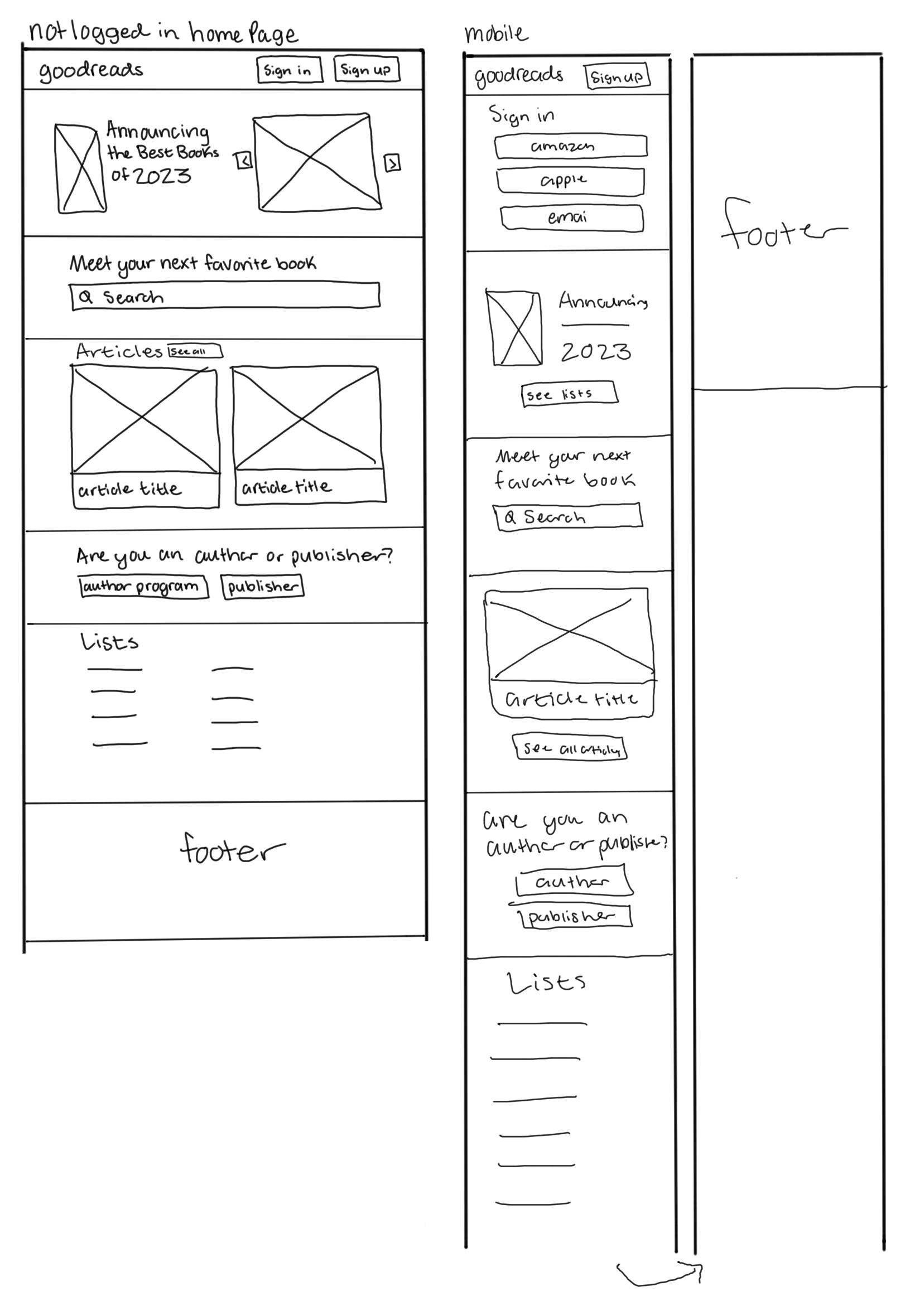
Low-Fidelity
Utilizing the user flow that I created, I drew low-fidelity wireframes for a sign-in and change status flow. I also drew up low-fidelity wireframes to organize the content-heavy pages displaying the lists of books users have created, and the newly released books. I also explored different ways of condensing content, using tabs, and carousels. I received feedback on the spacing of content for mobile screens, including using 2 columns instead of 1 column for displaying books.


Mid-Fidelity
The next step of the process involved creating mid-fidelity wireframes. Advised by the feedback on the low-fidelity wireframes, I addressed concerns about specific spacing and layout. I implemented UX techniques like columns and 8-point grid spacing to organize the content layout of pages. I luckily received plenty of feedback about button placement and pattern organization.


High-fidelity interactive prototype
The mid-fidelity wireframes informed my high-fidelity wireframe layout. The challenge of the high-fidelity wireframes was figuring out which buttons were primary, secondary, and tertiary, and deciding how to make the screens colorful and interesting without conflicting with the image and variety of content. I linked the screens in a flow with the prototyping feature in Figma, and ended up with one 8-screen flow, and a standalone screen. In total, I created 18 high-fidelity wireframes.
Gathering feedback from UX mentor
On my high-fidelity prototype, I received feedback on specific calls to action. For example, I had a button “Vote for this book” on each row of a list, I implemented a shorter call to action “Vote” since the button already implied that the vote would count for the book of that row. I also received feedback to clarify my button colors for primary and secondary calls to action, and the size of clickable options.


Conducting user testing interviews
Interviews
I conducted 3 user testing interviews with various peers. Over half of the users were confused about what Goodreads was for, as they never previously used the platform, this confusion largely started at the first screen, the home page, which had very little information on what type of platform Goodreads is. Users largely did not struggle with the experience, but they requested small UI changes, like moving an arrow or adding more color. Users liked the new releases page, but they requested the information on the desktop version to be added to the mobile version.
Updates
Considering the testing feedback I received, I modified the home page, the first of the sign-in and change status flow, to include more information on what Goodreads does, and how users may use it. I also added more color to the Listopia page and moved the carousel arrows so they would not overlap the book covers. As for the mobile experience of the new releases page, I added the genre and month information to the bottom of the page, this information was a side column on the desktop version.
My thoughts on the Goodreads redesign
Goodreads has many more pages than the ones I explored. I would like to approach the community aspects of Goodreads, like their messaging and forum features. If I had more time I would try to consider more global design of the platform and the goal of the application as a whole. As it is, I focused on content layout and visual design, as there were not many user input and choices in the screens and flows that I chose.
What I learned
I learned a lot about space management through the course of this case study. Having to consider the necessity and luxury of information and space in a good way to experience the consequences of decisions. I believe I could have done more creative work in terms of interesting visual design, and in other projects, I will attempt to be more brave with those choices, and make them complement the content.